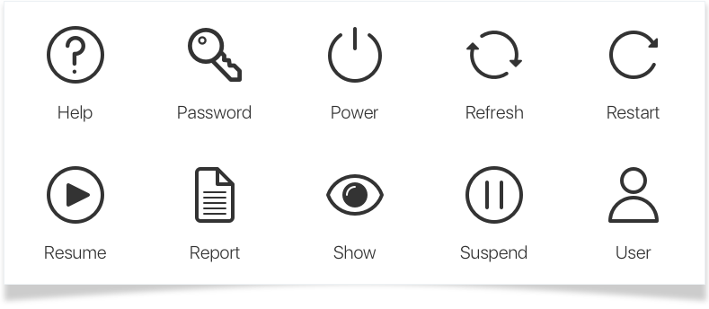
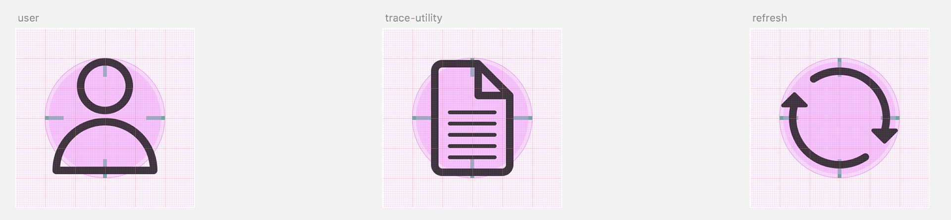
Sample of the final icons, ready to use and be scaled across the platform
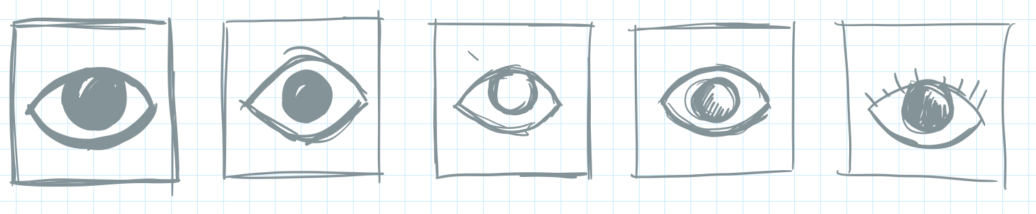
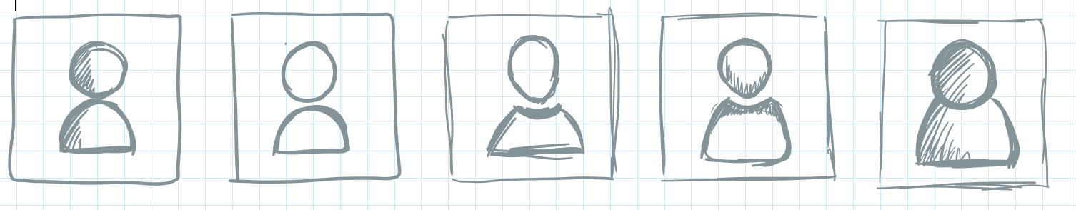
Sketching the concepts
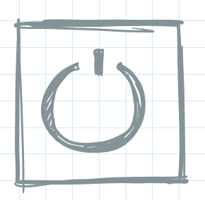
I started by sketching out some ideas for icons, based on a square grid, so that all icons would fit in the same space, regardless of aspect ratio. The sketches may not be Museum worthy, but they help set the direction for the final set.
Refinement and review
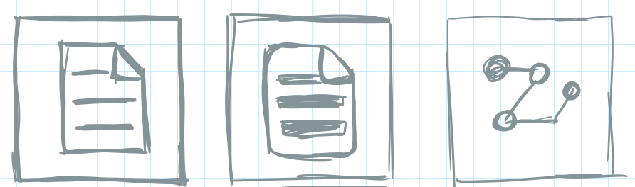
After sketching the ideas, I moved into Illustrator to begin refining the concepts. It's a messy process at this point, but I don't like to limit the ideas by worrying too much about the grid, pixel perfection, or layer naming. This is a rough canvas - meant to think and create fast - almost a warm-up exercise.
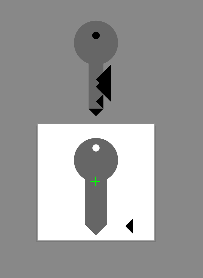

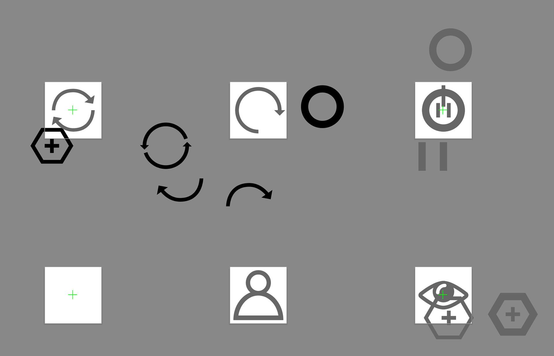
Building a cohesive set
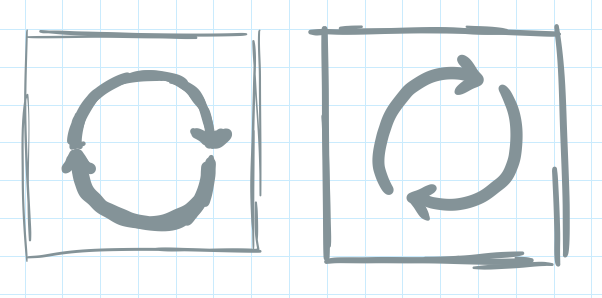
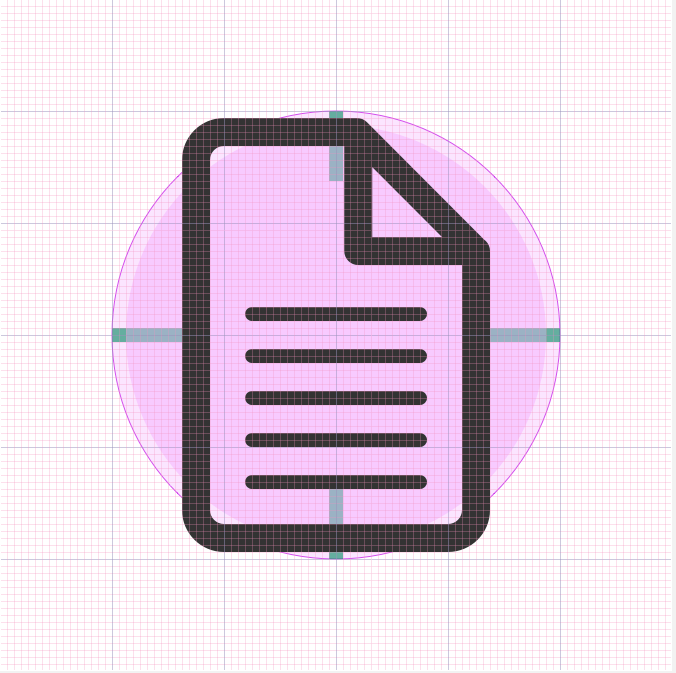
Now is the time to put the grids to use. I start by building the icon at the largest size in the UI - for this project it was 64px. Creating lines at a weight that will scale down (and up) well, without loss of detail. The grid below includes green guides that I utilize for maintaining the aspect ratio of the icon, both in portrait and landscape, which will aid in building consistency in the larger set. In this case, a horizontal icon's width is the same as a vertical icon's height.
starting to conform on the grid, building in aspect ratios
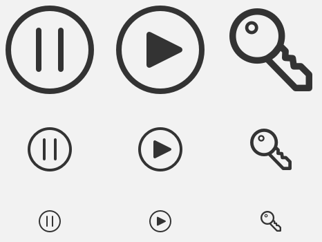
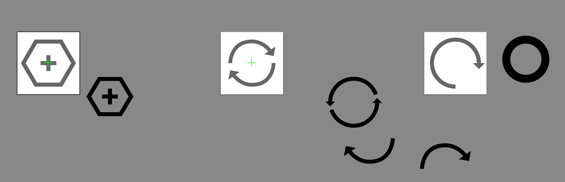
Testing scaling to make sure there was no loss of detail at 16px